UX@UA Brand Identity
Branding refresh for the largest UX community in Arizona
2019 · Brand Design
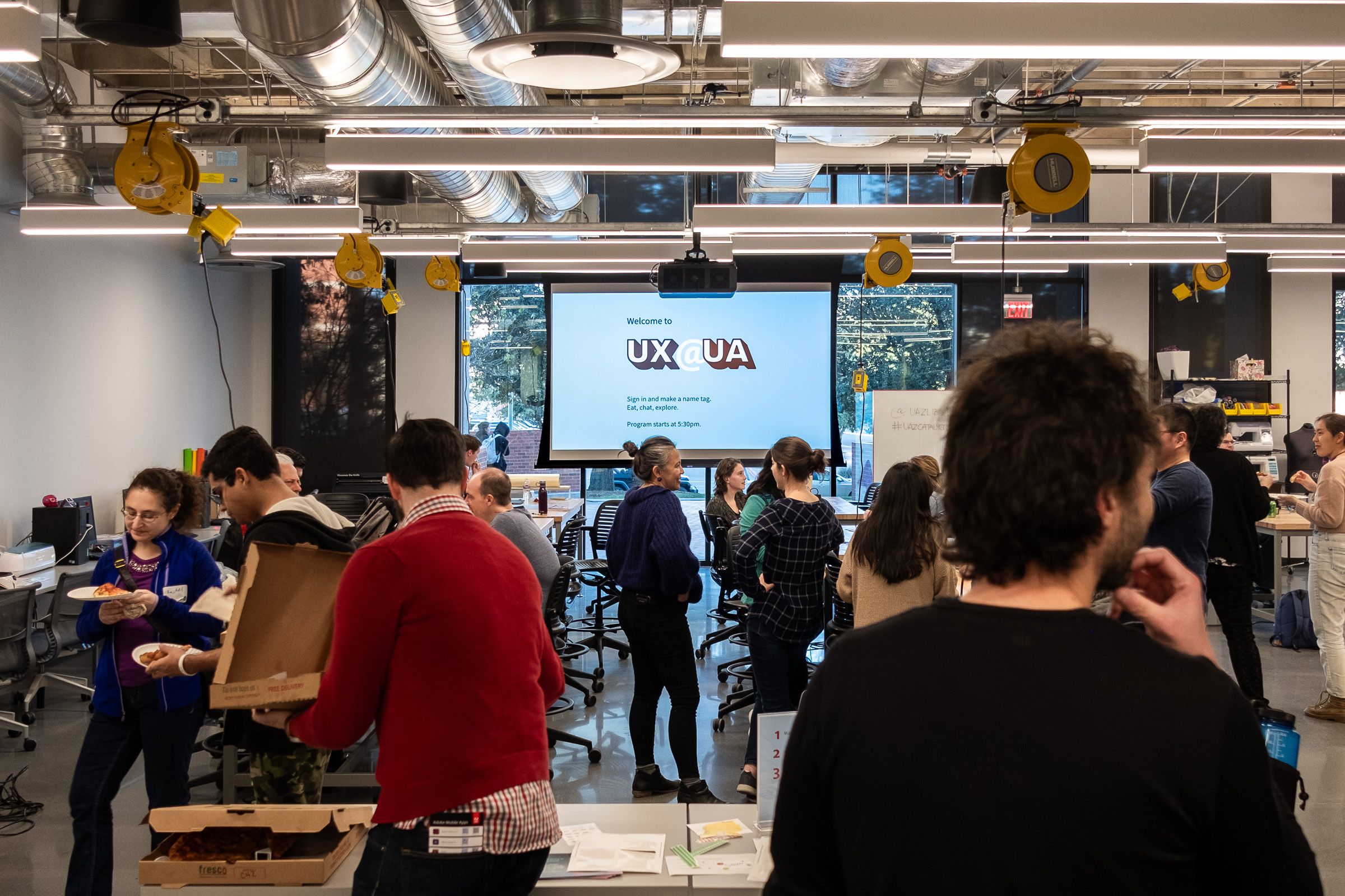
UX@UA is the largest community for UX professionals and learners in Arizona. The community is based at the University of Arizona (UA) and hosts regular in-person events in Tucson, as well as virtual events and consultation services online. The community was founded in 2018, and as of 2023, over 1,400 members joined the community from all over the world through events and social media channels.
In 2019, I became an organizer of UX@UA and was invited to design the community’s branding.
Goal
The community’s organizers hoped to see a versatile branding that fits various use cases such as event signage, social media posts, slide decks, and websites. The brand elements should be familiar to those affiliated with the University of Arizona, and instantly recognizable for event attendees and social media followers.
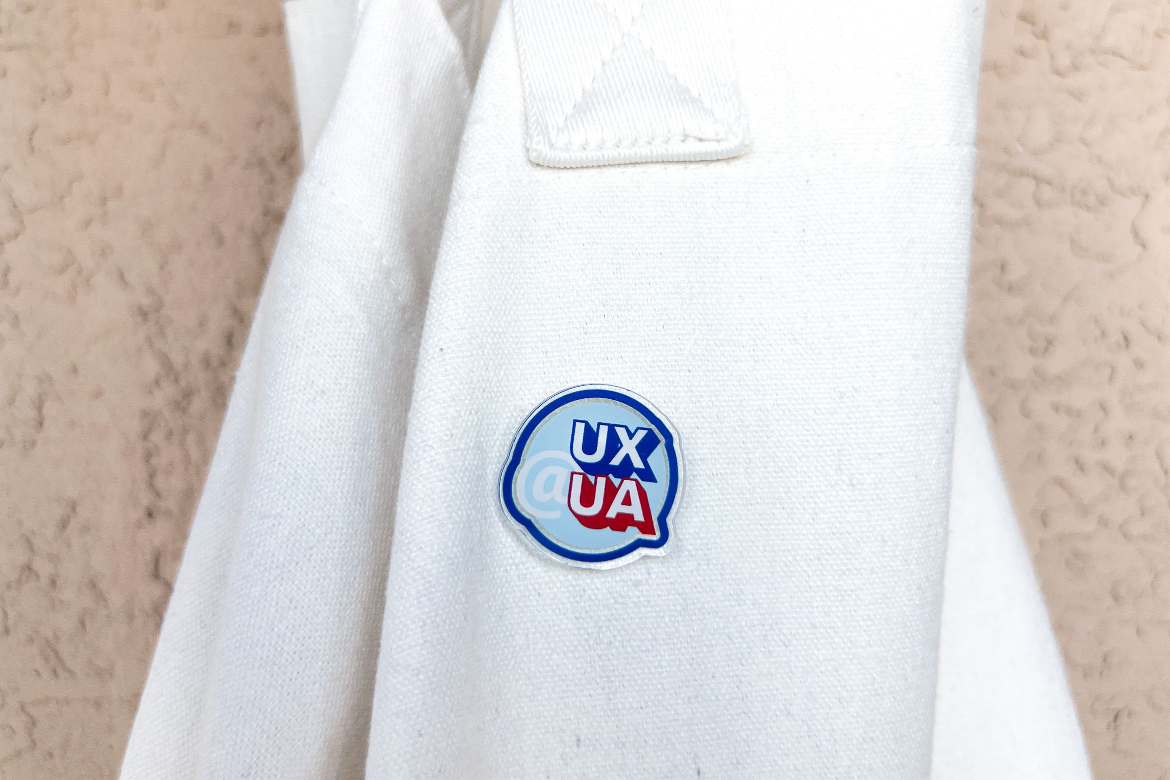
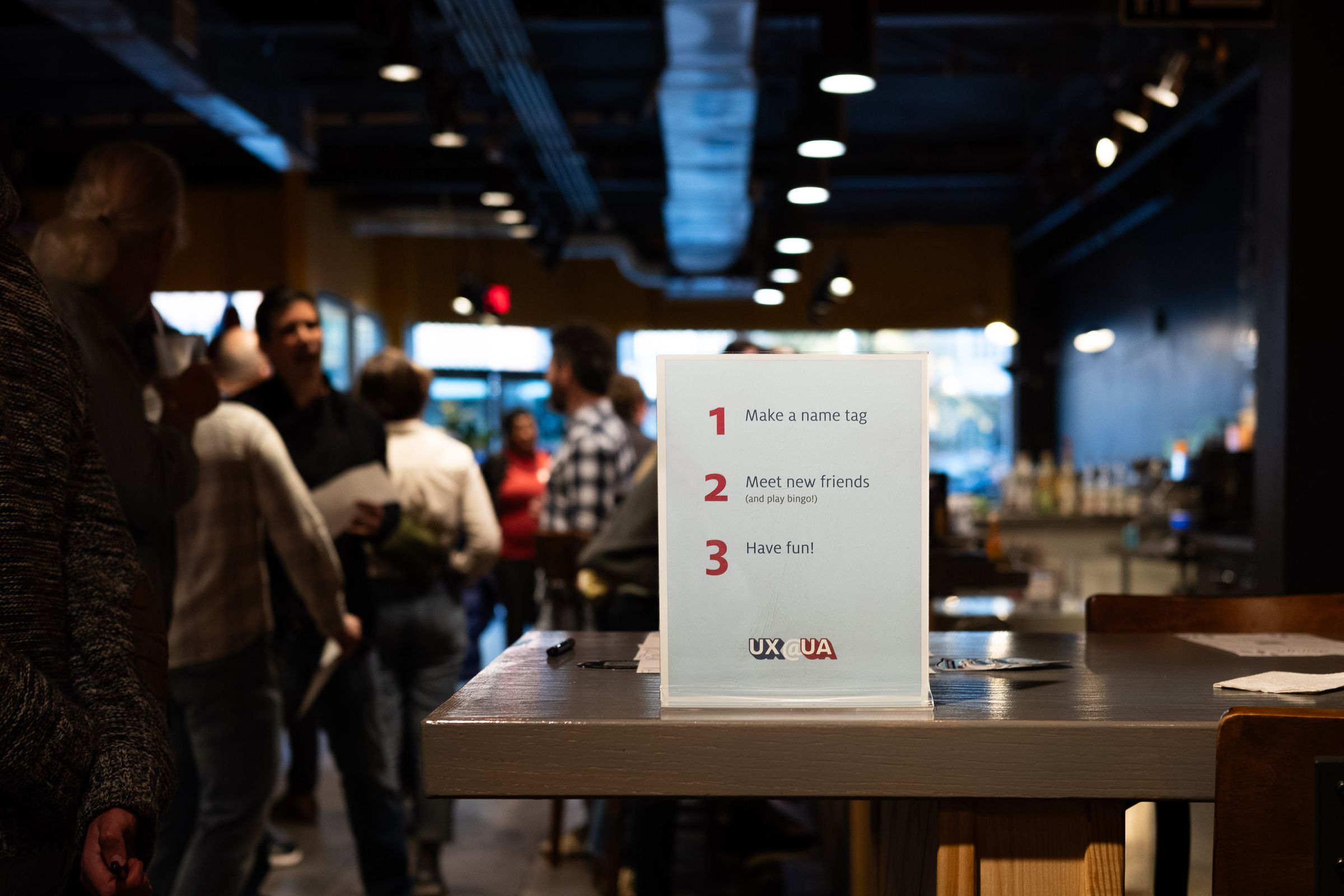
In addition to the digital brand assets, the organizers also wanted to use the new branding to produce marketing swags to give away at in-person events.
Brand Research
I surveyed UX@UA members on Slack to research the identity of the community. Then I worked with the other organizers and outlined the community’s brand voice, which impacts not just the branding but also the way the organizers communicate with members:
- Cheerful, but not silly
- Organized, but not retro
- Experimental, but not rebellious
- Educational, but not scholarly
We also gathered adjectives that describe and don’t describe UX@UA’s voice. People think the community is welcoming, active, colorful, resourceful, collaborative, and clear. They think words like dense, wordy, scattered, and jumbled don’t describe its voice.

Design
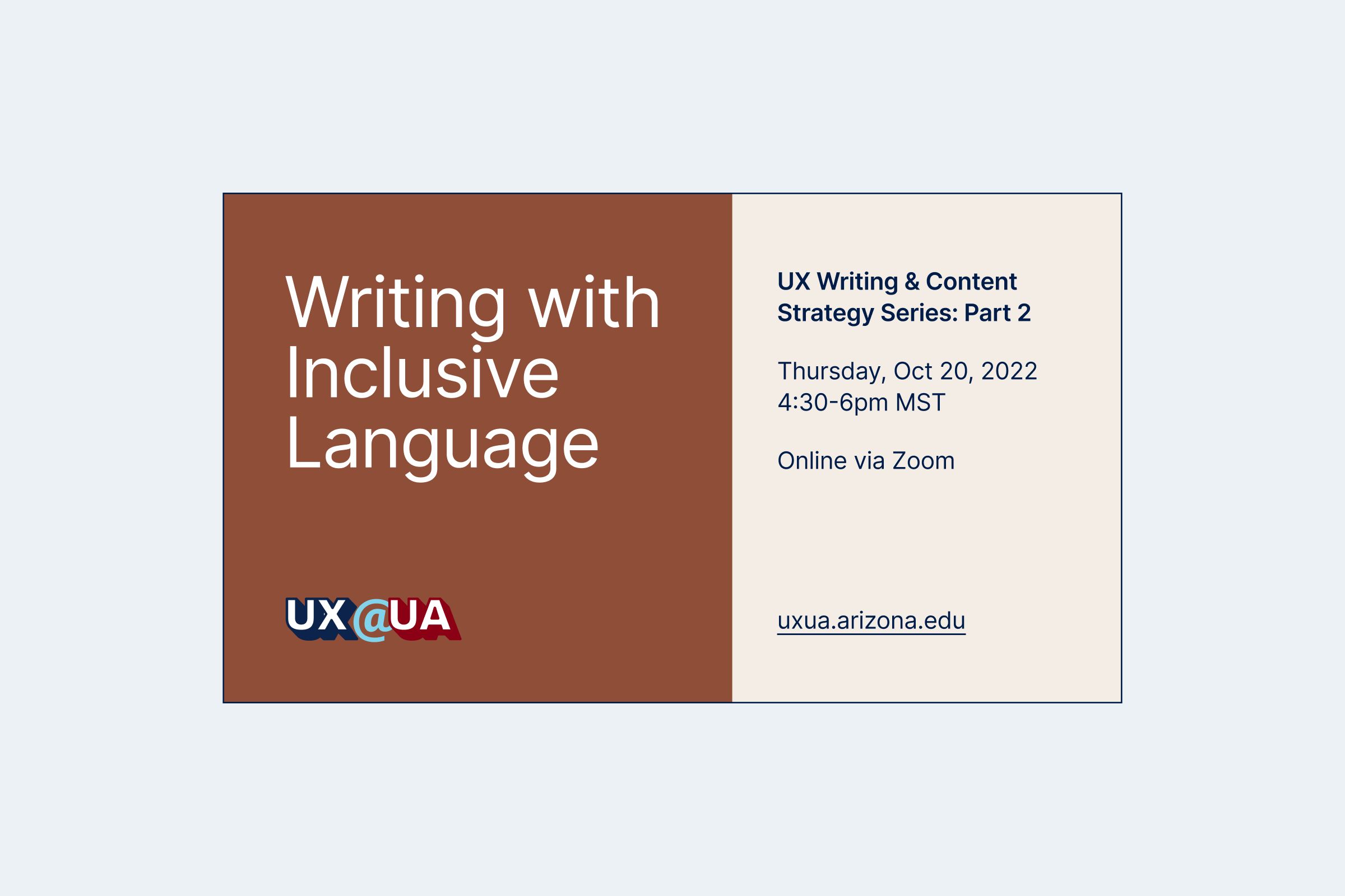
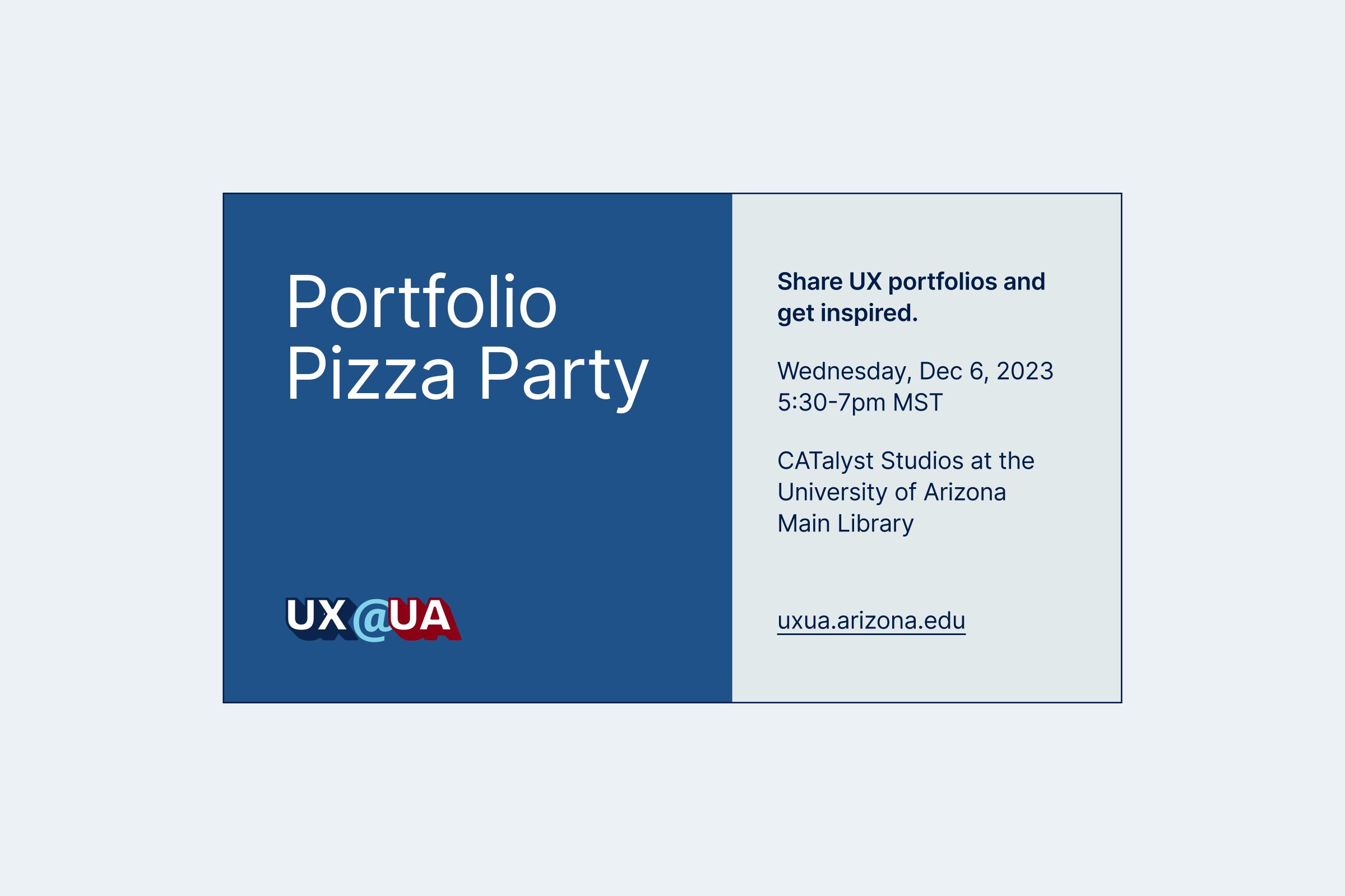
Because of UX@UA’s affiliation with the University of Arizona, I chose the two primary colors (Arizona Red and Arizona Blue) from the university’s brand, and paired them with an accent color (Sky).
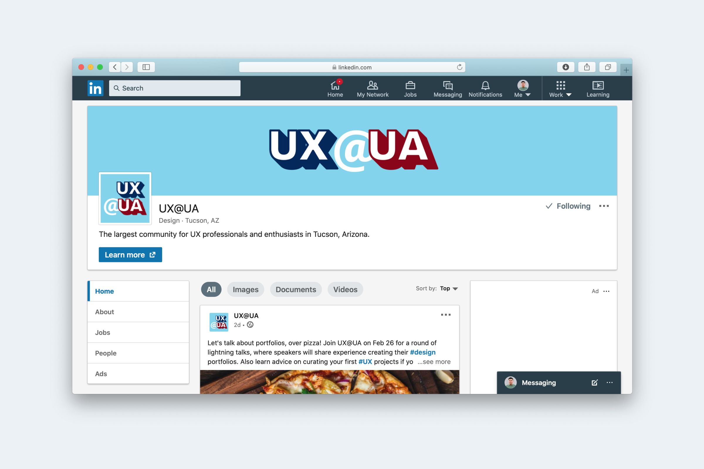
The subject of the logo are four letters in the community’s name. The @ sign was positioned in a playful way to break the alignment of the letters, leaving an impression that matches the community’s brand voice. All characters use UA’s brand typeface at that time, Milo.
The characters in the logo can be arranged in two ways: wide and square. The wide logo are used in banners, slides, or large printed materials. The square logo fits social media profiles and can be adapted to create stickers, pins, or other small marketing swags.