MovieLens
Designing for high information density
2017 · Web Design
MovieLens is a recommendation system for movies built and maintained by GroupLens Research at the University of Minnesota. The user builds a profile by rating movies they have watched, and MovieLens generates new movie recommendations based on their rating.
I designed MovieLens’ movie card component that displays movie information and prompts rating, conducted user research, and developed a prototype in the website’s Angular-based framework.
Goal
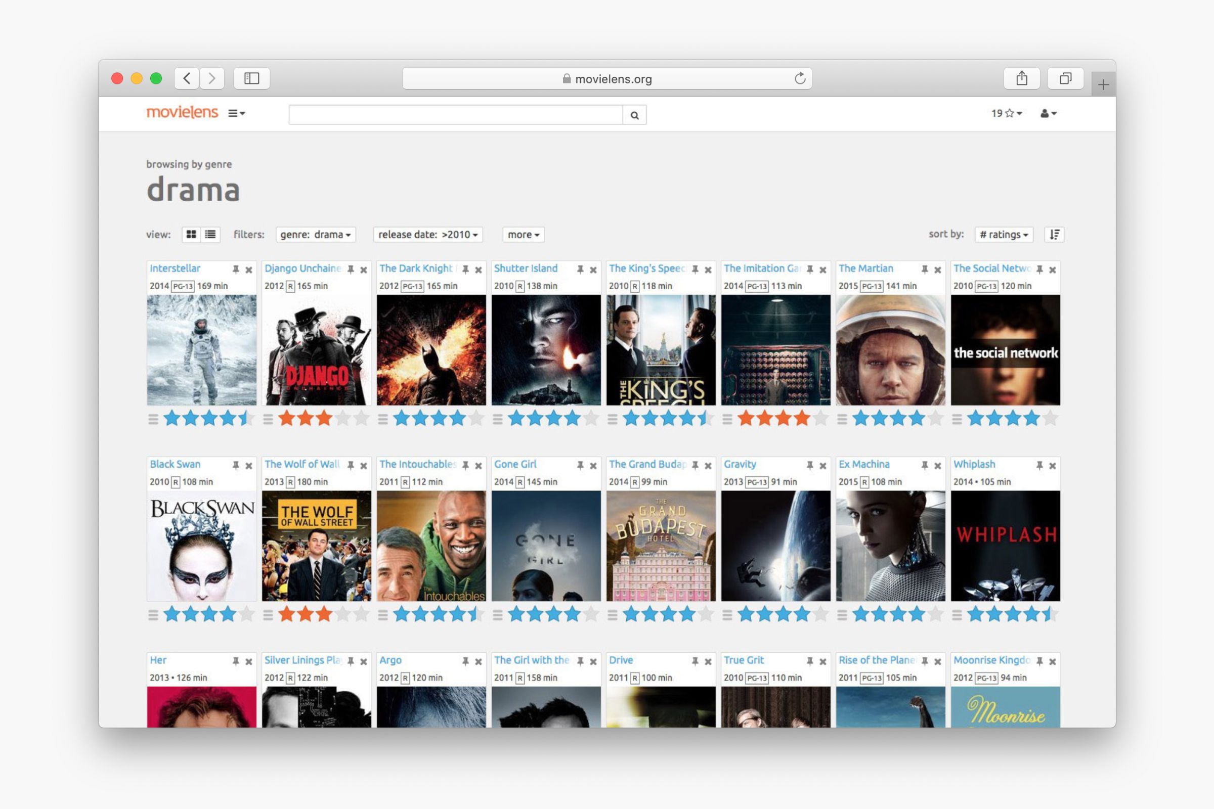
Researchers at GroupLens Research use MovieLens to collect movie rating data and train the recommendation systems. They wanted to see a website that encourages the user to rate movies, and helps the user easily find movies they watched. The previous MovieLens interface was designed to meet these needs.
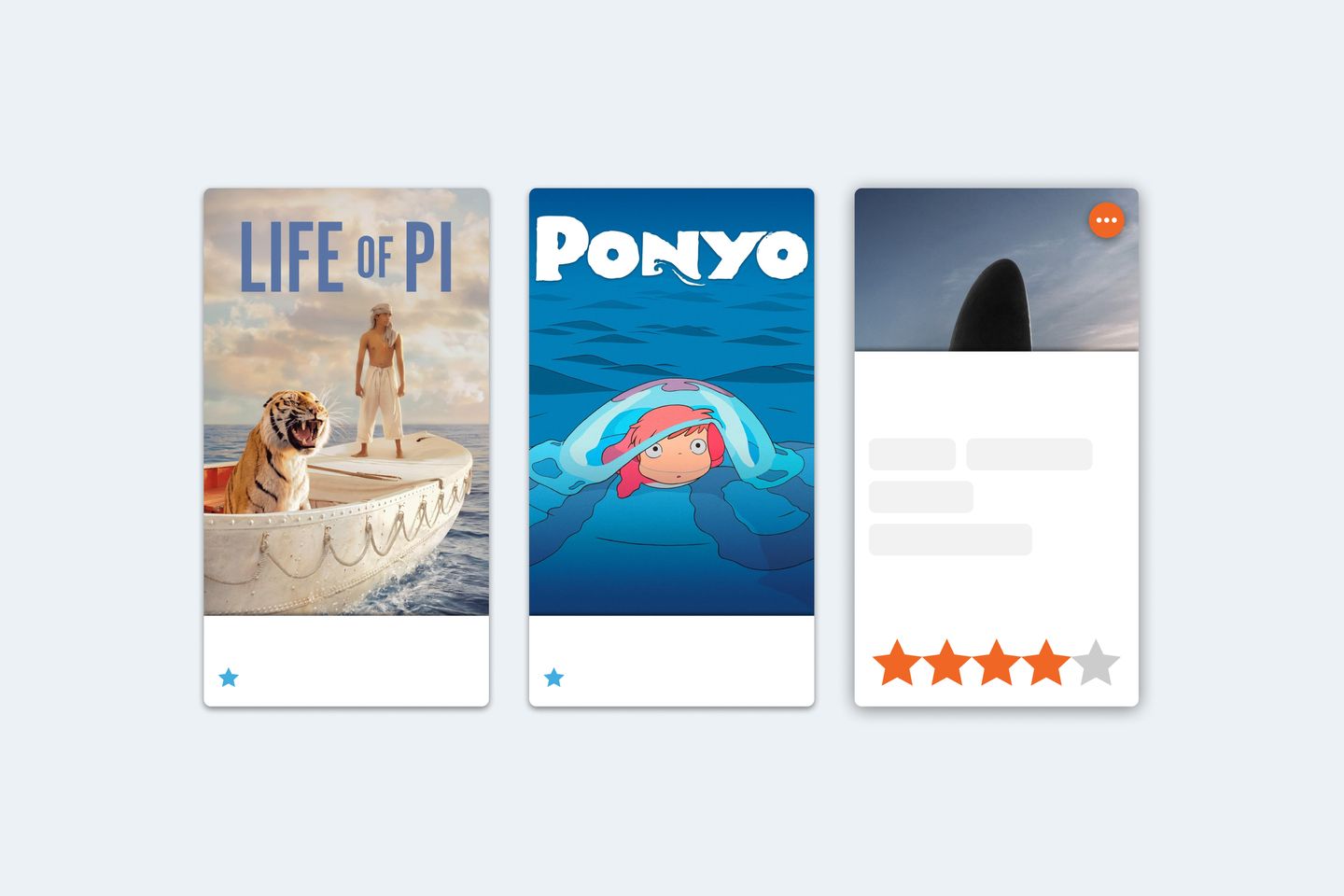
The previous design, however, was not favored by users. 12 out of 14 active MovieLens users I interviewed did not like the previous site design. They thought the movie cards, which was a blend of text, icons, stars, and a movie poster in a small space, made pages look cluttered and confusing.
Another pain point was the previous design used differently-colored stars to indicate system predicted rating and the user’s actual rating, but users had a hard time figuring it out.
In the 2017 redesign, I focused on addressing these two pain points and keeping the card-based rating experience.
Design
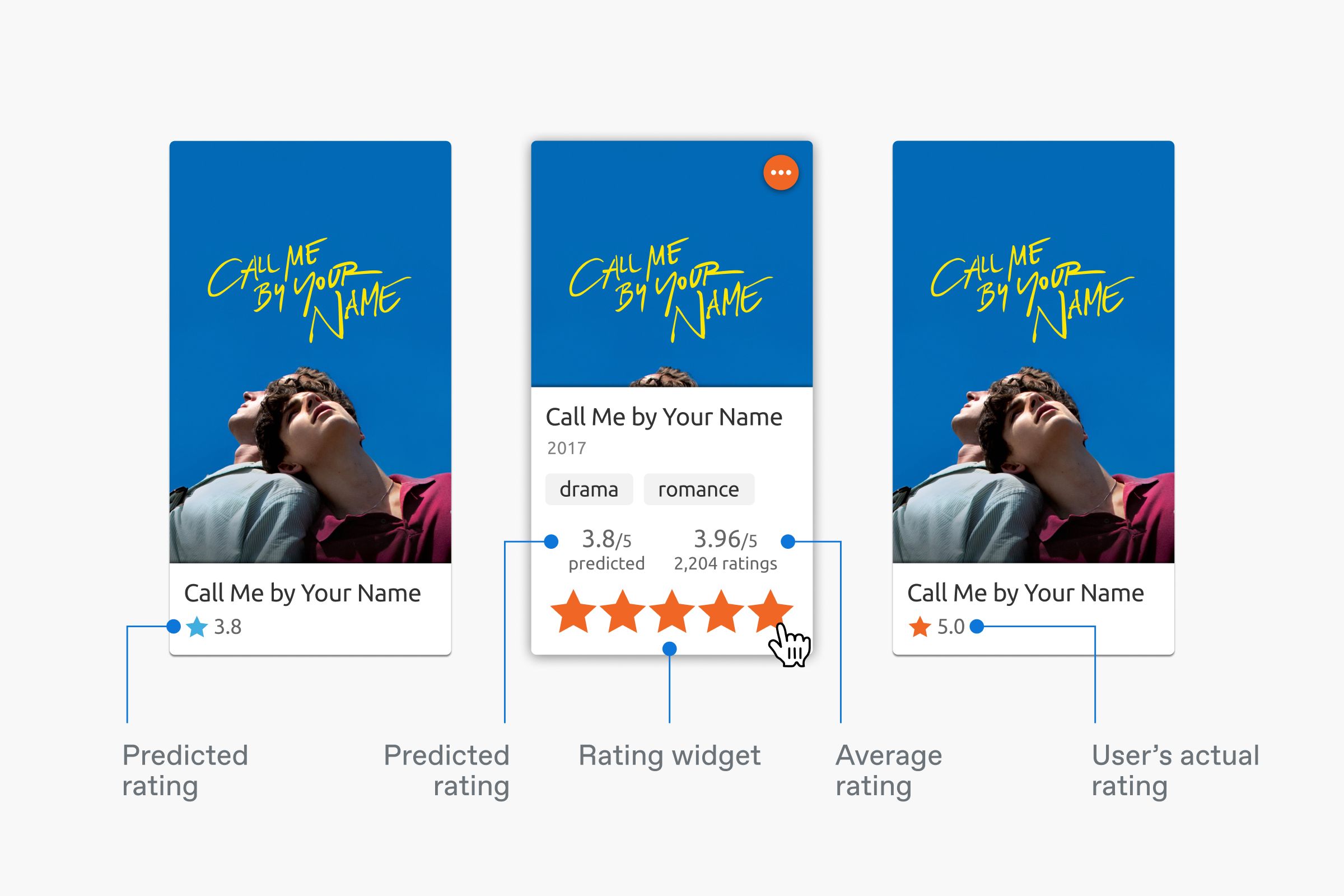
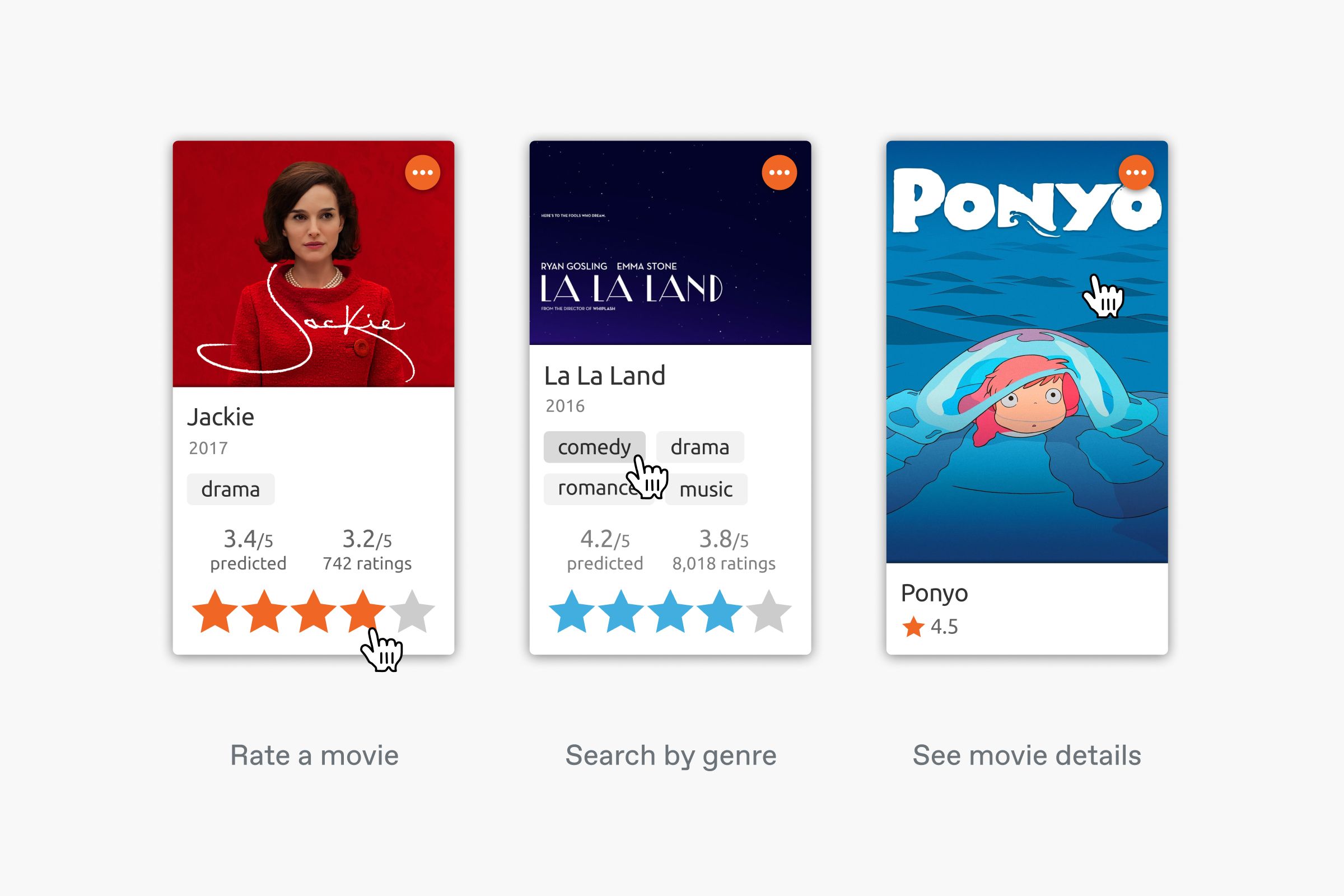
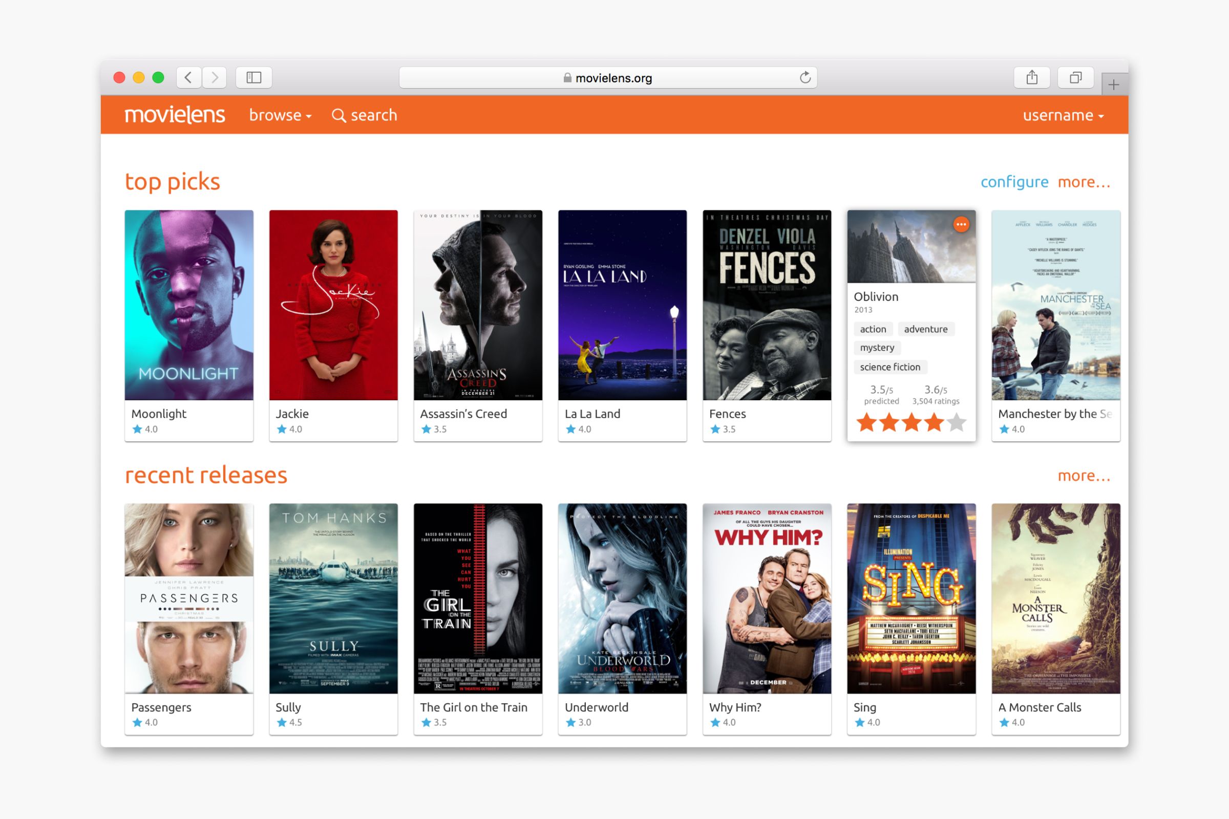
The size of a movie card is approximately 176 x 320 pixels. However, it displays a large amount of information, including the movie’s poster, name, release year, genres, predicted rating, user rating, rating widget, and additional actions.
The challenge was to present dense information in a clean an intuitive way. I was inspired by belly bands (or obi in Japanese) often used in packaging of books or notebooks. The band moves up and down, covering or revealing information on the book cover.

In a similar structure, I created a moving information panel for the movie card. In its default state, the panel stays on the bottom of the movie poster and displays the movie name and predicted rating.
When the user points the mouse at a movie card, the panel moves up to reveal more information, including release year, genres, predicted rating, average rating, and the rating widget. The user can then use the rating widget to add their rating.
Once the mouse leaves the movie card, the panel moves back to its original state, and the rating changes to the user’s actual rating. The user can also click on the movie poster to go to the movie details page.
Result
All 13 participants in a subsequent usability testing preferred the new MovieLens design over the previous one. Participants mentioned the new design “looks cleaner and faster,” “feels smooth,” and “is easy to understand.”
Limitations
During my time at GroupLens Research, I had only tested the movie card prototype above with desktop browsers. The design potentially had usability issues on mobile due to the animated information panel triggered by mouse hovering and UI elements with small click targets.
Another planned next step was to test and optimize the movie card design for screen readers.