Craft Design System
Government web design system that focuses on user and developer experience
2018 · Web Design, Web Development, Design Documentation

Craft is a web design system created for the State of Minnesota Department of Human Services. As the state government’s first web design system, Craft’s name came from its five design principles: consistent, reusable, accessible, familiar and trustworthy.
I performed visual design for the components, developed live prototypes using React, and conducted research with stakeholders and end users.
Goal
In 2017, the State of Minnesota Department of Human Services (DHS) started its Systems Modernization project, which aims to rebuild online public service platforms with newer web technology.
Style governance became a challenge as the project teams set on a journey to build the new platforms. Developers chose from several front-end frameworks, and without a consistent design standard, the style, visual design, and accessibility differed from project to project.
As a member of one of the project teams, I wanted to build a library of usable and accessible components that match the State’s brand, voice, and tone. In the meantime, I hoped that the component library is shared with the other modernization projects for a consistent user and developer experience. So, I teamed up with contributors from other projects, including designers, developers, and marketers, and started the collaborative project to build Craft.
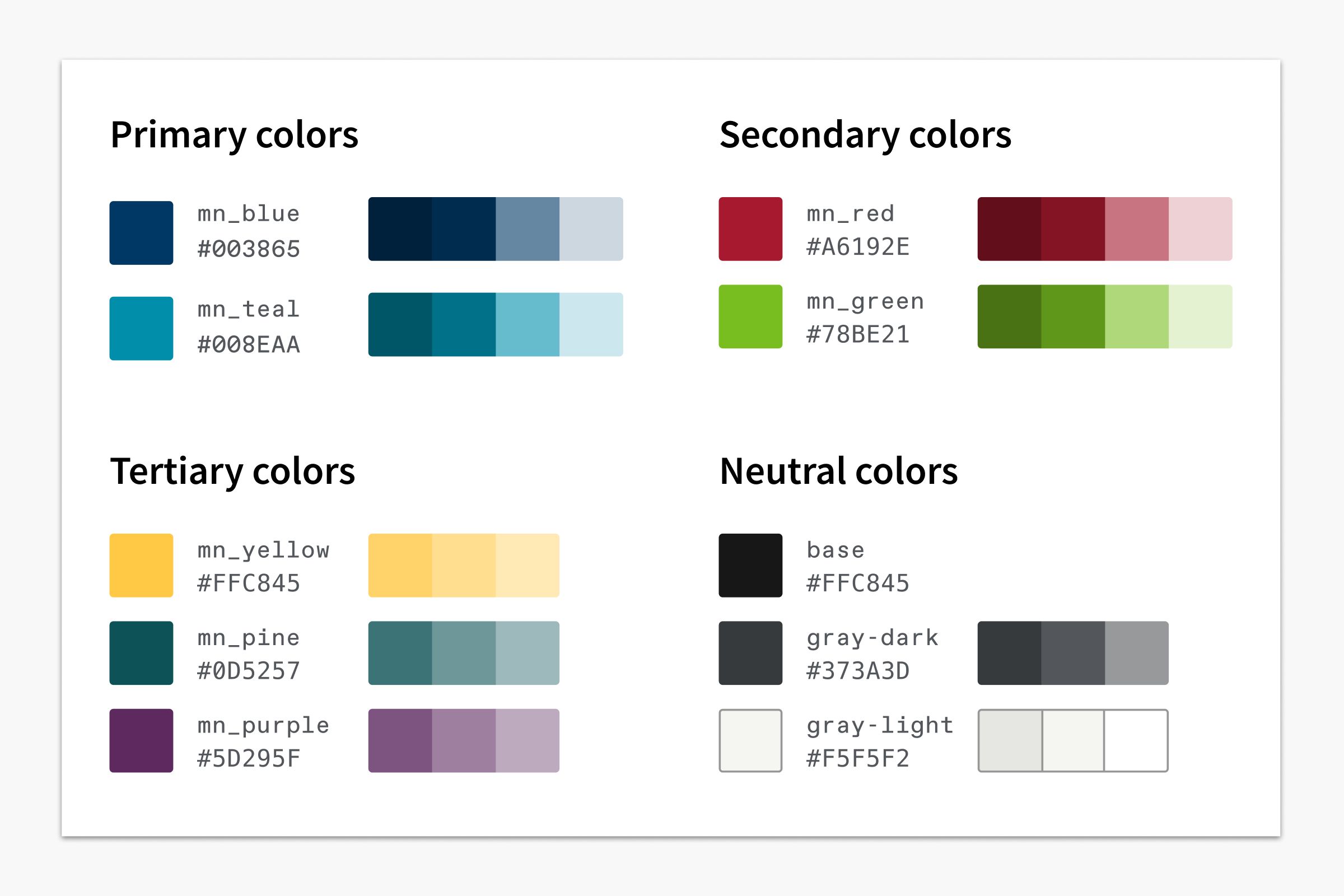
Colors & Typography
I used the State of Minnesota’s 2017 brand guide for printed materials as my visual design reference. First off, I created a color palette in which most colors meet WCAG AA color contrast when paired with black or white foreground text.
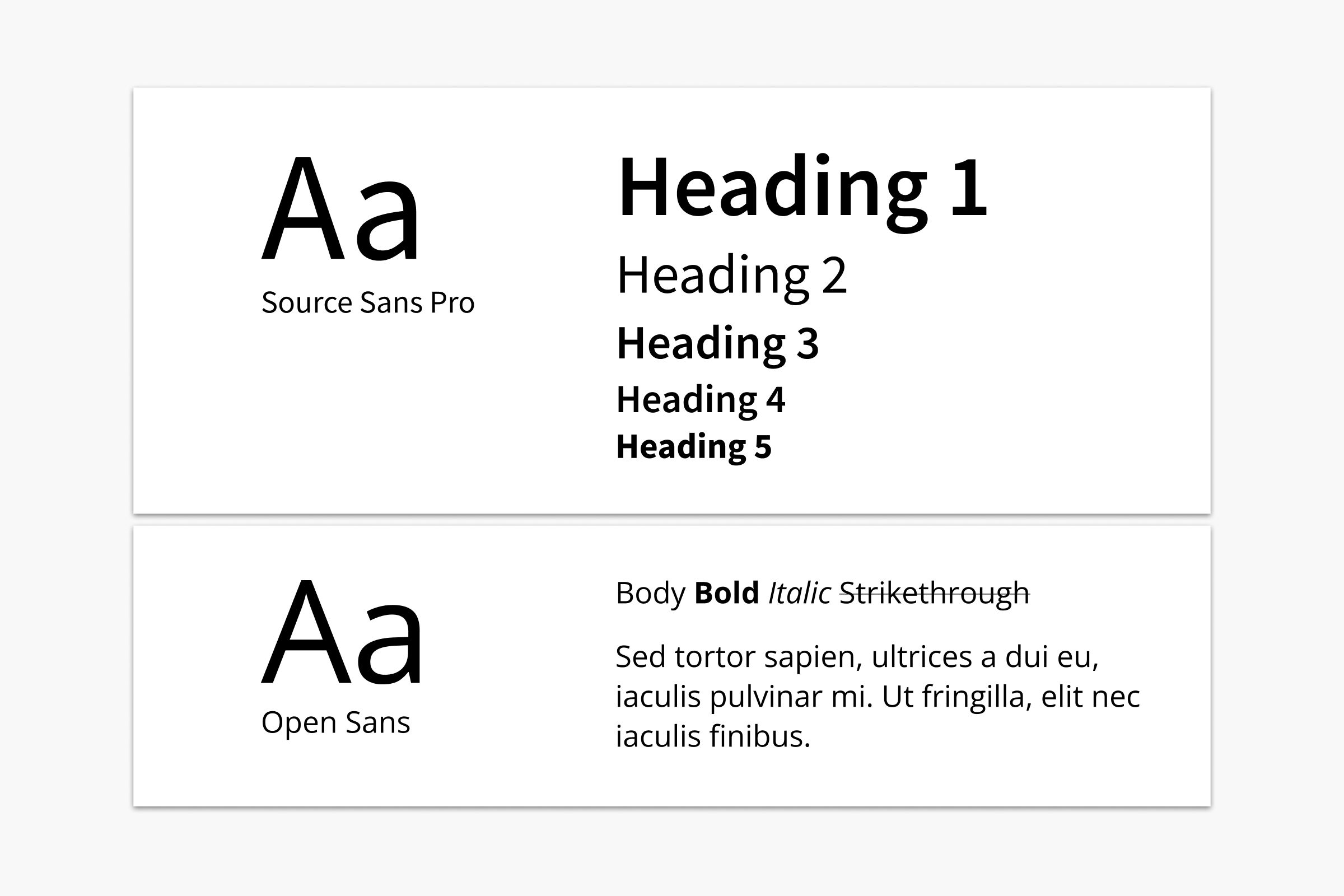
Following the marketing advisors’ guidance, I selected Source Sans Pro as Craft’s default typeface for headings and Open Sans for body copy. Both are open-source fonts served by Google Fonts.
Components & Patterns
Craft was designed to be a system that streamlines both design and development processes. From day one, each component was designed in Sketch and developed in a React framework.
We hoped developers using other front-end frameworks to also have access to Craft components’ style, behavior, and interaction without building from scratch. So, the team created a fallback option using plain HTML/CSS and jQuery.
Following the Atomic design methodology, I first designed basic components, then used them to assemble common UI patterns in government web applications. Below are some examples.
Buttons
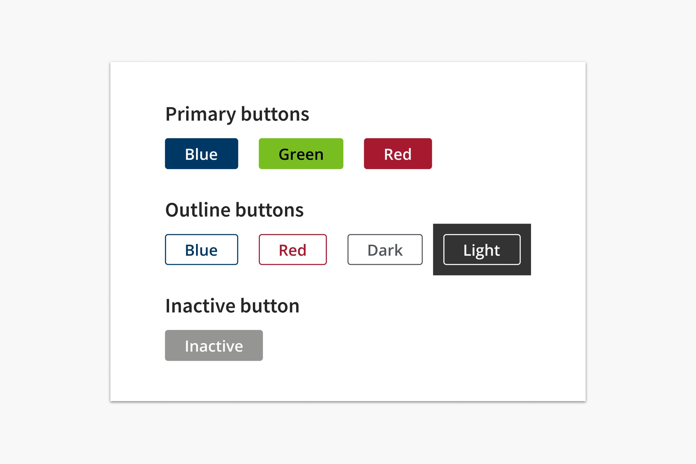
<h4>Primary buttons</h4>
<Button>Blue</Button>
<Button type="green">Green</Button>
<Button type="red">Red</Button>

<h4>Outline buttons</h4>
<Button type="outline">Blue</Button>
<Button type="red outline">Red</Button>
<Button type="dark">Dark</Button>
<Button type="light" class="bg-dark">Light</Button>

<h4>Inactive button</h4>
<Button type="inactive">Inactive</Button>
We used the styled-components library to package style variations with the component. For example, the developer can easily apply styles for a Button component by adding classes such as type="outline" and type="dark".
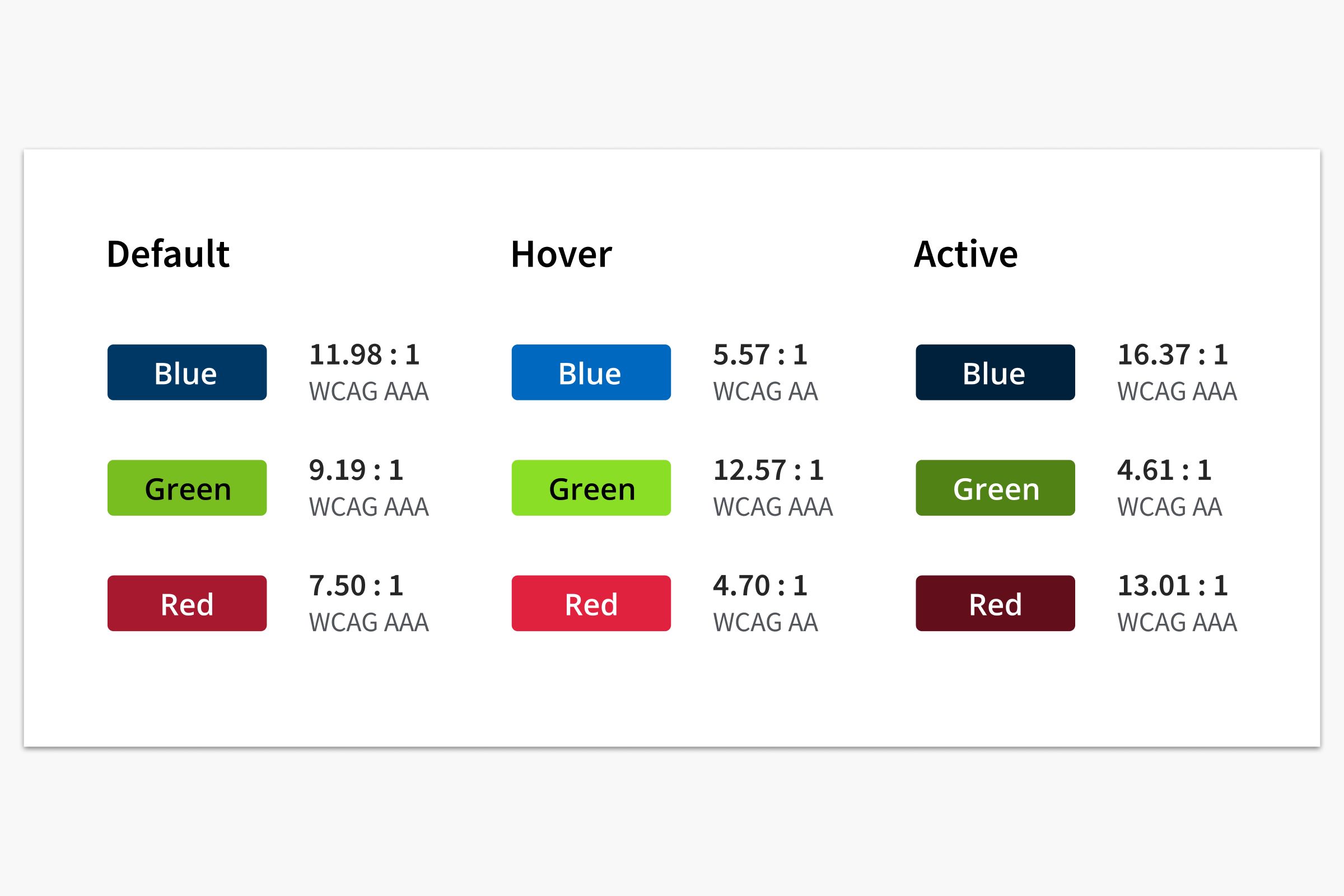
I also adjusted the color of each button’s three states to ensure the color contrast meets or exceeds WCAG AA.
Form Validation
Government websites tend to leave an impression of being unusable and inaccesssible, and webforms often take the blame. The Craft Design System aims to improve the usability in government webforms starting with displaying helpful error messages.
The Social Security number field was one of the common fields in the State’s webforms. It was also one of the trickiest when it comes to form validation, since formatting and error prompts were different by platform.
Craft comes with webform patterns that include the Social Security number field. Using one line of code, the developer can insert the form field combined with its auto-formatting and validation features.
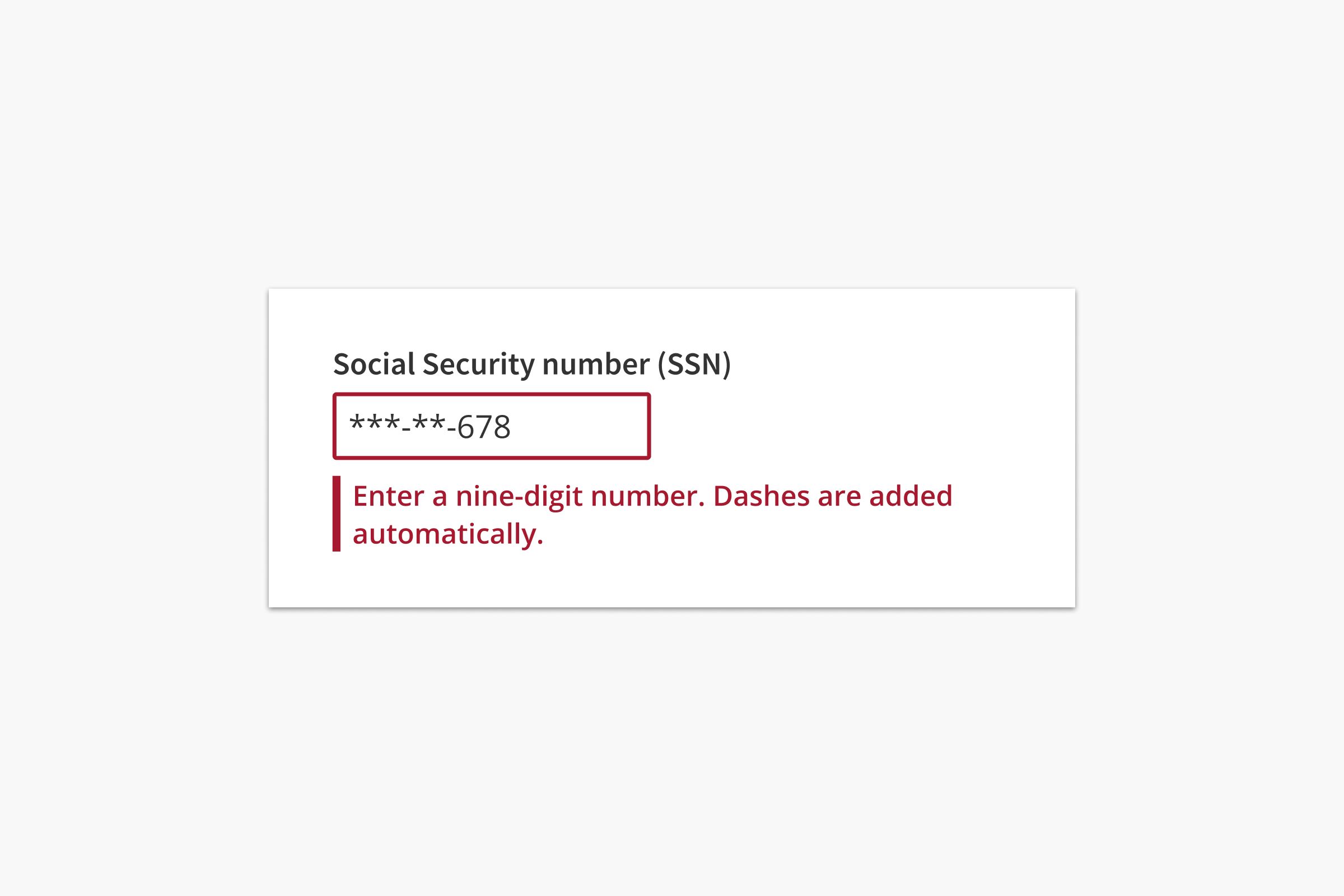
<FormField type="ssn" />Special Patterns
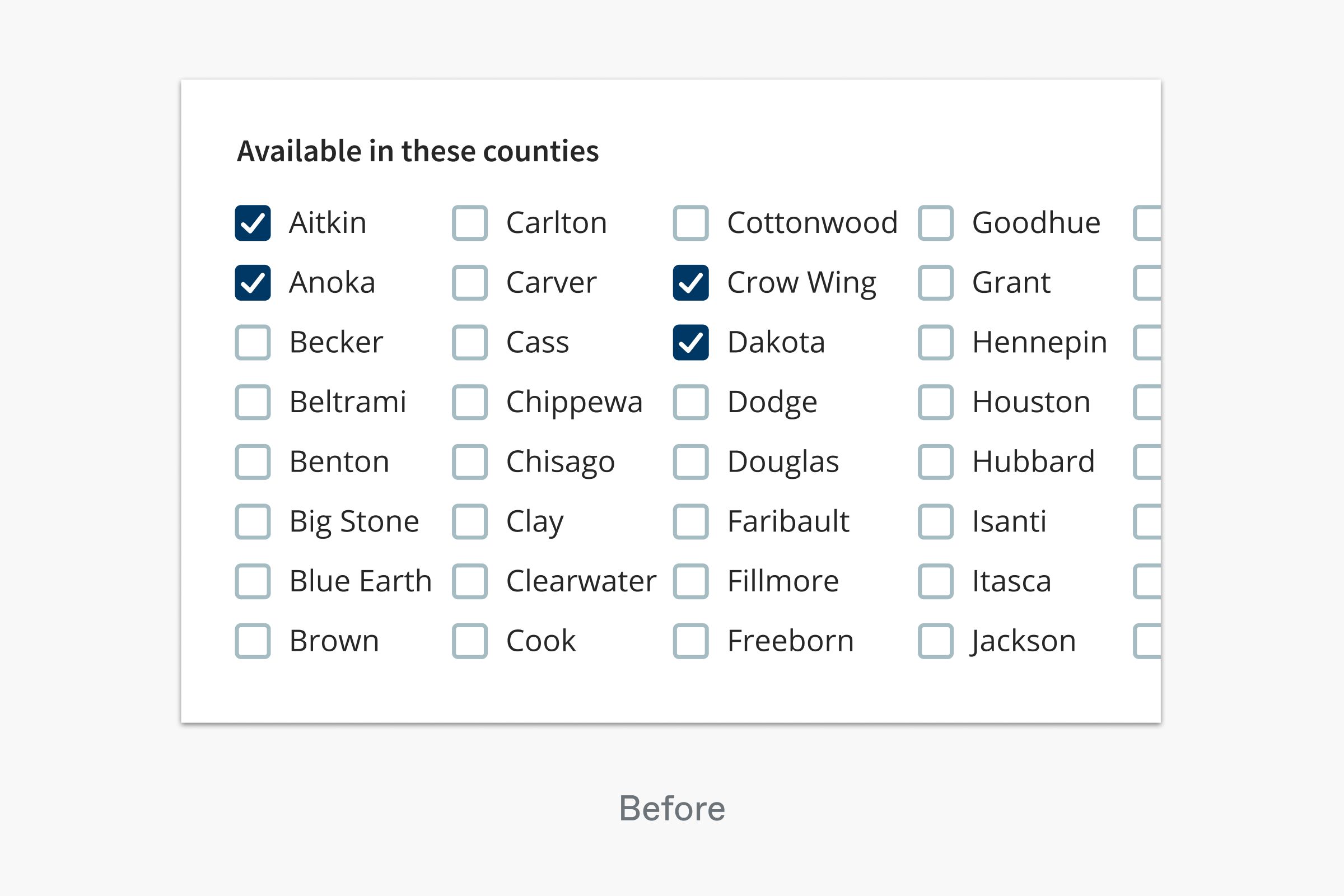
Craft includes patterns unique to the State of Minnesota’s web platforms. For example, many webforms used by county and state workers include a question prompting eligible or impacted counties.
Minnesota has 87 counties, and the question was usually accompanied by 87 checkboxes, which was overwhelming, inaccessible, and painful to use.
I designed a special pattern called label box to solve this issue. It comes with a single field with the 87 counties’ names built in. Once the user starts typing the name of a county, matching results show up in a list that follows the curser. The user can then navigate with the mouse or keyboard or hit enter to select the first result in the list.
<FormField type="county" />Similarly, the pattern for selecting counties is a part of the FormField component and can be added to a webform with one line of code.
The label box pattern may also be customized to support other input values.
Common Webforms
In addition to individual form fields, Craft has a FormModule that includes common combinations of form fields.
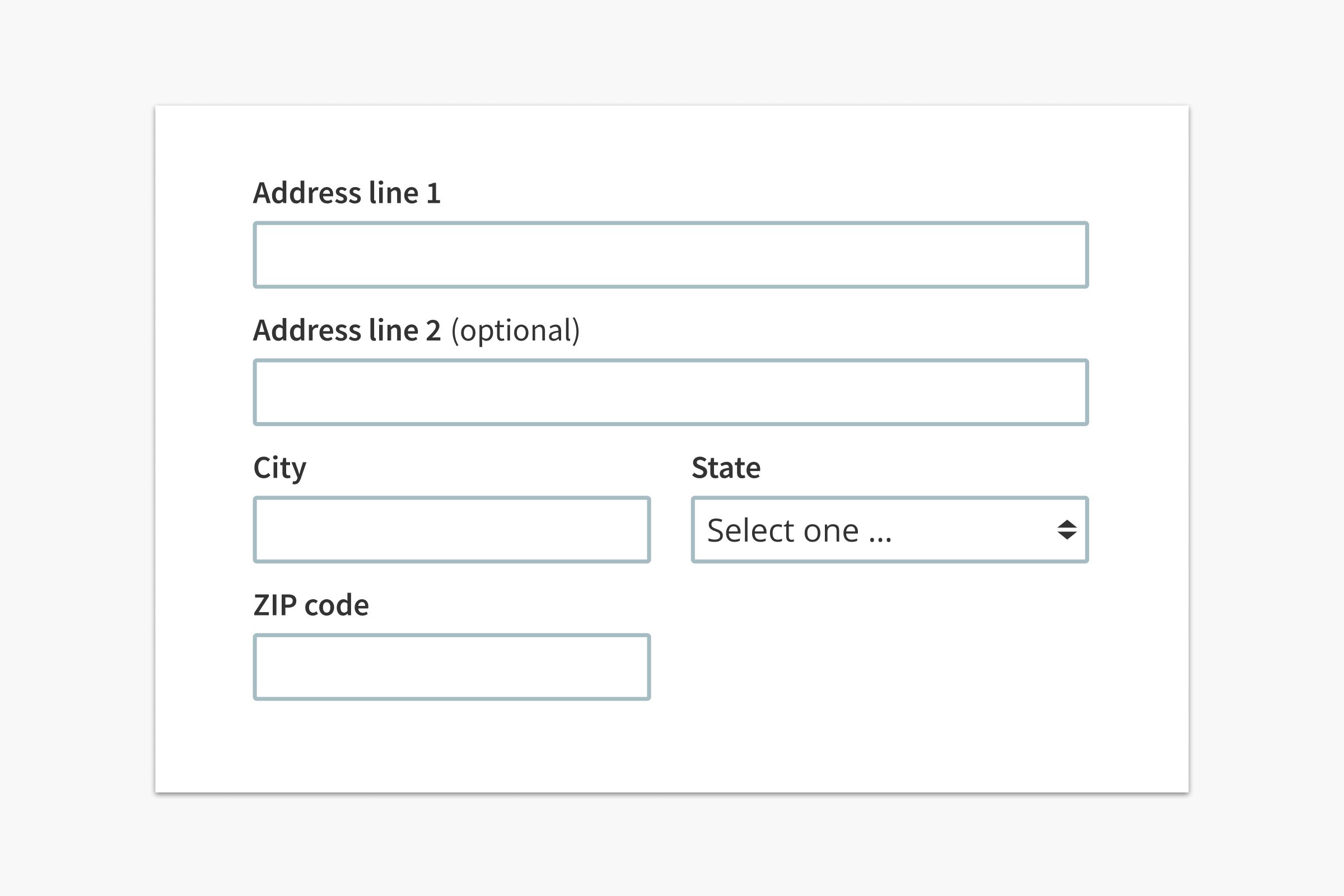
For example, the address form is one of the most frequently-used webform patterns while also laborious to implement. With plain HTML, just the state select menu alone has more than fifty lines of code. Users reported the form had inconsistent validation on different platforms.
<!-- Address form: plain HTML -->

<div class="form-address">
  <label for="add1">Address line 1</label>
  <input id="add1" type="text" class="col-2x required" />
  <label for="add2">Address line 2</label>
  <input id="add2" type="text" class="col-2x" />
  <label for="city">City</label>
  <input id="city" type="text" class="required" />
  <label for="state">State</label>
  <select id="state">
    <option value="AL">Alabama</option>
    <option value="AK">Alaska</option>
    <option value="AZ">Arizona</option>
    <option value="AR">Arkansas</option>
    ...
  </select>
  <label for="zip">ZIP code</label>
  <input id="zip" type="text" class="required" />
</div>
Craft addresses this issue by combining the address form fields and the recommended validation pattern in one component. This approach aims to save time for developers while also improving usability for the end users with a consistent data format and error messages.
<!-- Address form: Craft -->

<FormModule type="address" />